Tasteful Renovations
Hi! I’m Daniel. I joined the Happy Scale team a few months ago to lead the design of the app, and we’re about to launch our first real set of design updates. For Happy Scale users and curious app designers alike, I thought it’d be fun to walk through a few of the ideas that led us to this release.
Two things are true about Happy Scale today:
- It is a well-established, well-loved weight-tracking app used by many people around the world.
- It contains a number of aesthetic flaws and outdated design ideas.
This is a tricky situation for a designer. On the one hand, how lucky am I to work on an app that is successful in spite of some very fixable design issues? Nowhere to go but up! On the other hand, all sorts of people are happy with the app as it exists today, and the last thing I want to do is inadvertently stomp on the very thing someone loved most about Happy Scale.
I live in an old neighborhood, and there used to be a little old house next door to us. It wasn’t a beautiful old house, exactly — it was a bit overgrown, and it didn’t have a front door, which was endlessly confusing for delivery workers — but it was quirky and charming and well-loved. Over the past year, some new owners tore it all down and rebuilt a 5-bedroom mansion. They very expensively finished the basement before bothering to put gutters up, and then we had a historic rainstorm, and, well…they had to very expensively finish the basement again.
With Happy Scale, we have no intent of tearing anything down, building from scratch, forgetting about gutters and flooding the basement. People tend to recoil at ground-up redesigns of their favorite apps, much like my neighbors now recoil every time they walk by what we have dubbed “The Mausoleum”. Instead, we are going to carefully and tastefully renovate — the app has great bones, but we think there’s lots we can do to modernize the app and make it more enjoyable and straightforward to use.
With this in mind, our first design goal, broadly speaking, was to get the app into a better place aesthetically, without really changing any of the app’s content or functionality. We wanted this to feel like a welcome breath of fresh air for Happy Scale users, but more importantly, we wanted to lay some groundwork for ourselves. Many of the app’s core design problems today stem from inconsistent and fragmented use of color and depth across the app’s various themes — resolving these problems would force us to build cohesive models for how color and depth should operate in every part of the app.
Easier said than done, of course. No design decision lives in isolation, so building and applying these models often felt like untangling one massive knot. But I think we did it, and this release puts us in a much stronger position to ship big design improvements in the future. Let’s take a look!
Making friends with Liquid Glass
For anyone who doesn’t know the terminology, “Liquid Glass” is the new design language Apple rolled out in iOS 26. It’s characterized by interactive elements that are big, round, squishy, raised, and transparent in a way that bends and refracts background content — kind of like a droplet of water. It’s not universally loved, but it is the default system-level look, and so Happy Scale adopted it in its navigation controls last year.
This left Happy Scale’s design in some tension, though. While Liquid Glass elements are very round, and differentiate themselves from their background with big shadows and refraction, the rest of the app was much more square, and relied heavily on color contrast and outlines to separate foreground from background — the UI was almost entirely flat.
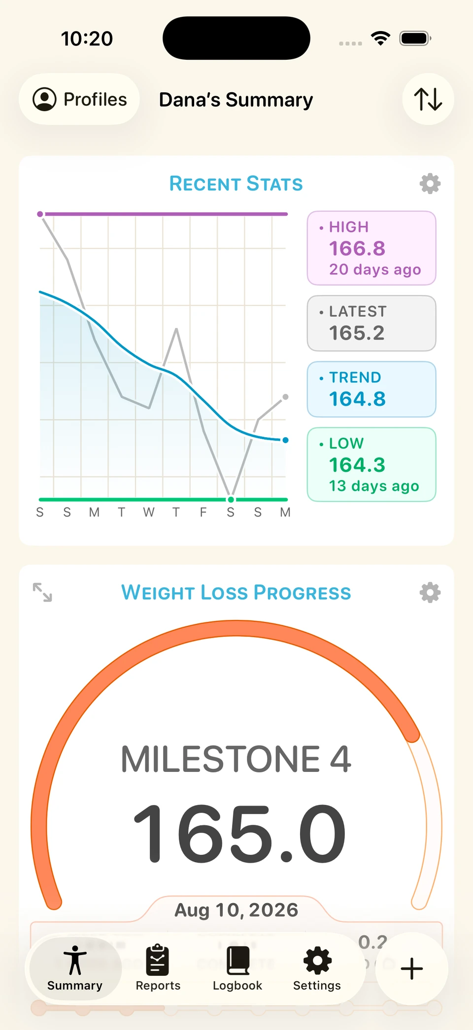
I don’t think every app needs to bend over backwards to make itself look like an “Apple app” — it’s okay that Happy Scale has its own look and feel, distinct from the Liquid Glass aesthetic. But if we want to comfortably bridge the gap between our app’s content and the glassy elements that sit on top, we need to make sure that gap isn’t too wide.
So, a few simple tweaks were in order. We made all of the cards in the app a bit rounder, and lifted them off the background with a subtle shadow. We redesigned card headers, using dark text that more closely matches the look of the navigation buttons, and darkened primary text throughout the app for the same reason. We replaced some bespoke controls with standard navigation bar controls where possible, and, in tandem with our color palette work (more on that below), we eliminated unnecessary outlines on many prominent UI elements.
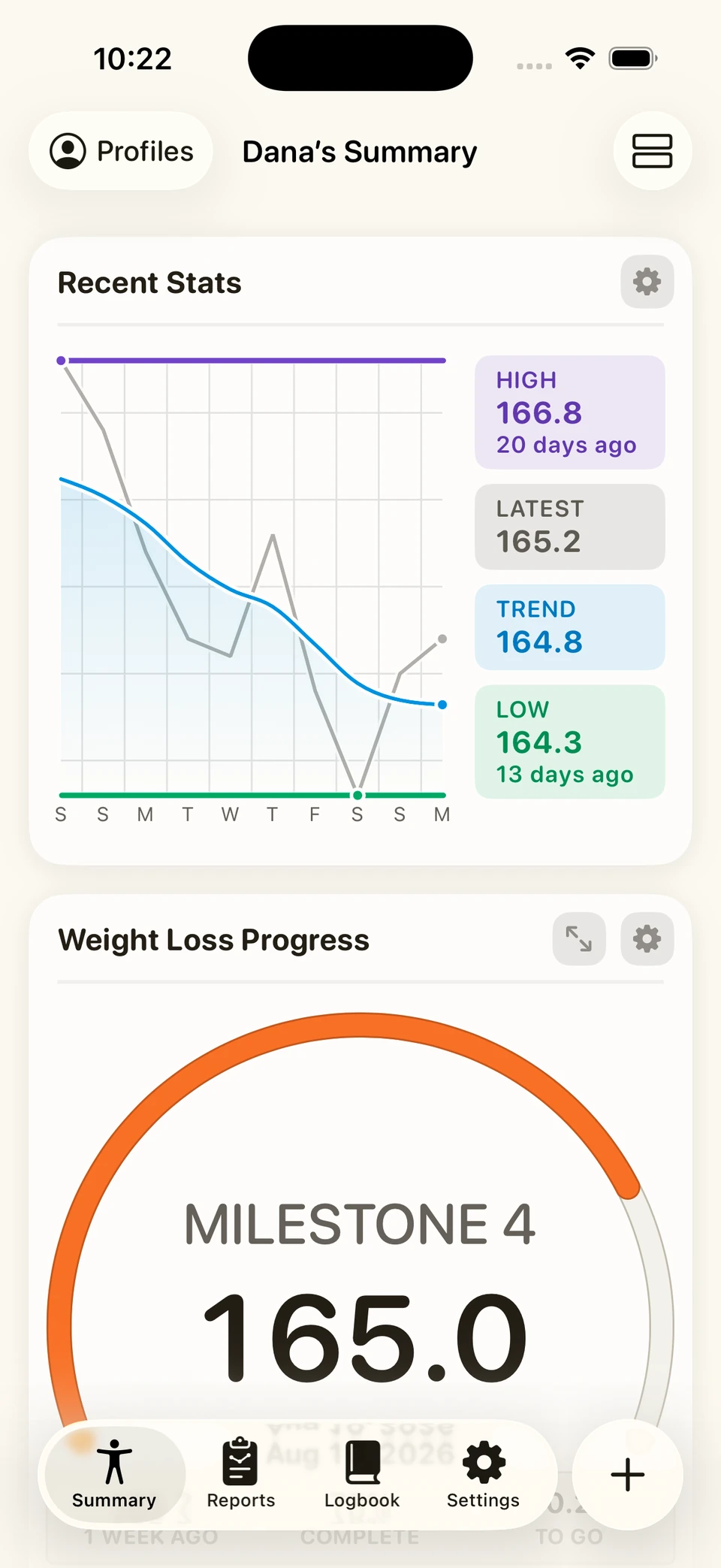
We think the net effect is an app that still looks very much like Happy Scale, but that sits a bit more comfortably and confidently underneath its Liquid Glass elements.
Establishing surface rules
An app consists of all sorts of screens and sheets and shapes flying in and out of view in different ways, and it’s useful to have a mental model for how each of these relates to one another in physical space. If I’m on screen A and tap to present screen B, it’s important that I intuitively know how this transition is happening, and where these screens settle in relation to each other. Making this relationship obvious is a big part of what gives users confidence navigating around the app, understanding where they are and what their options are at any given moment.
Happy Scale had a number of inconsistencies in coloring and presentation style that muddied the picture. Color in particular — i.e. what background color should a screen or component have, and why? — is an important thing to nail down in this equation, because color and contrast are important indicators of depth in apps, helping to describe the “physical” model of how one screen relates to another. Previously, by using the same themed background color in all screens regardless of presentation context, we were muddying the user’s sense of place in the app and creating all sorts of unnecessary design constraints.
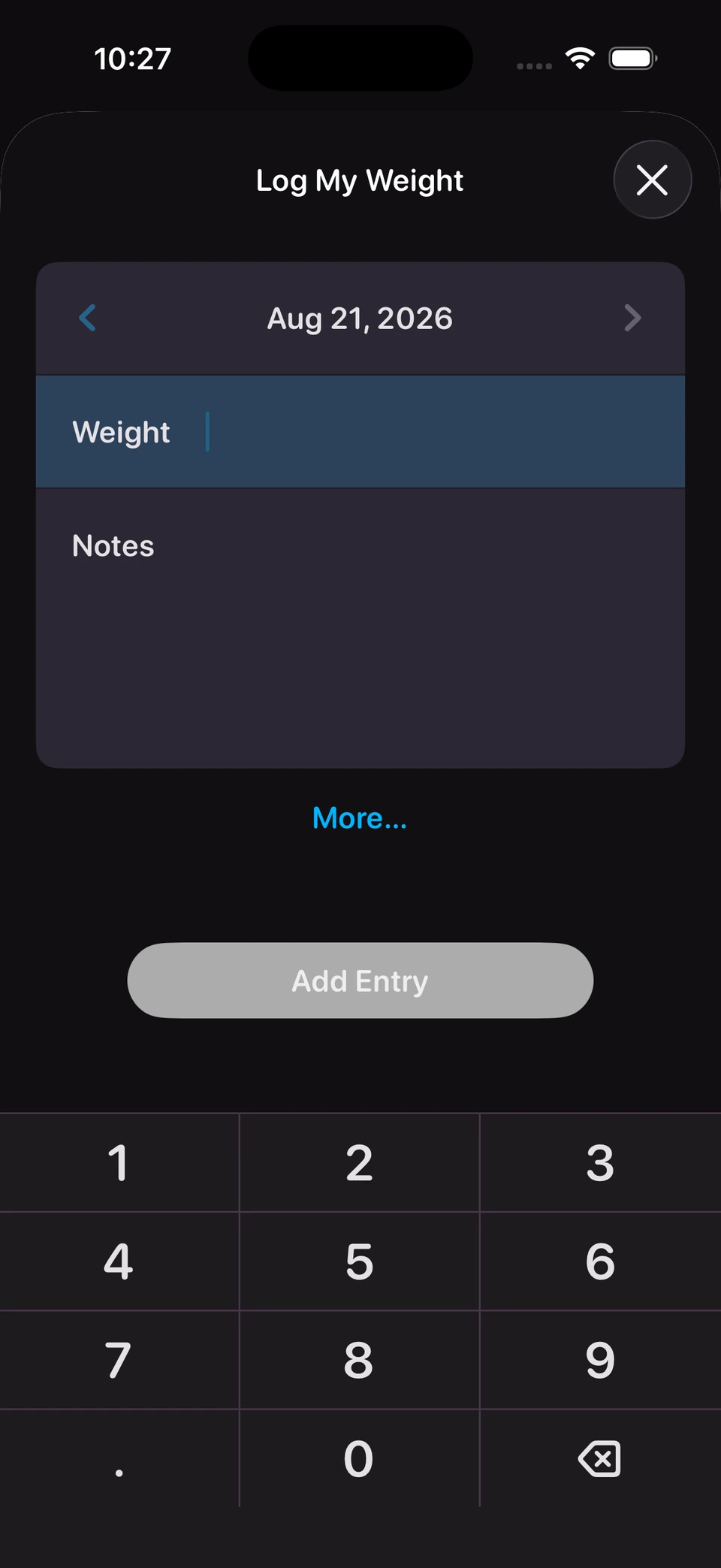
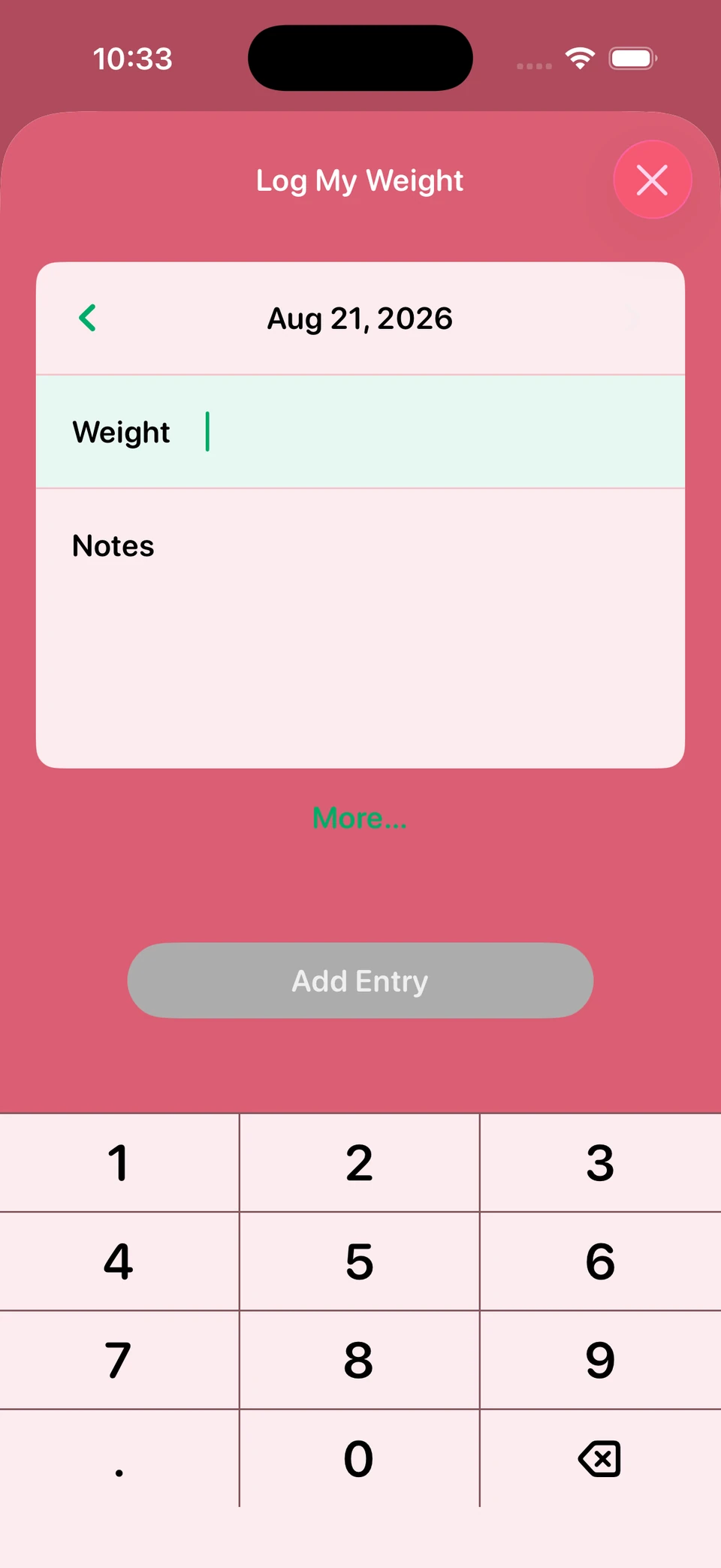
So, arguably the most noticeable change in the app is a change in how we use background color. We now think of all surfaces in the app as existing on one of three planes:
- Backing surface: the base layer of the app. Can be a bright, themed color, because it is not intended to support content directly. This allows us to maintain the character of the brighter themes that some users love.
- Card surface: the main content-bearing surface of the app. This is the color of all of the cards in the app’s main tabs, as well as any screens that are presented over top of our backing surface. Always a relatively neutral color (near-white or near-black).
- Overlay surface: used sparingly for any UI elements that need to be raised above a card surface — toasts, banners, etc. Typically a slightly lighter version of the card surface color.
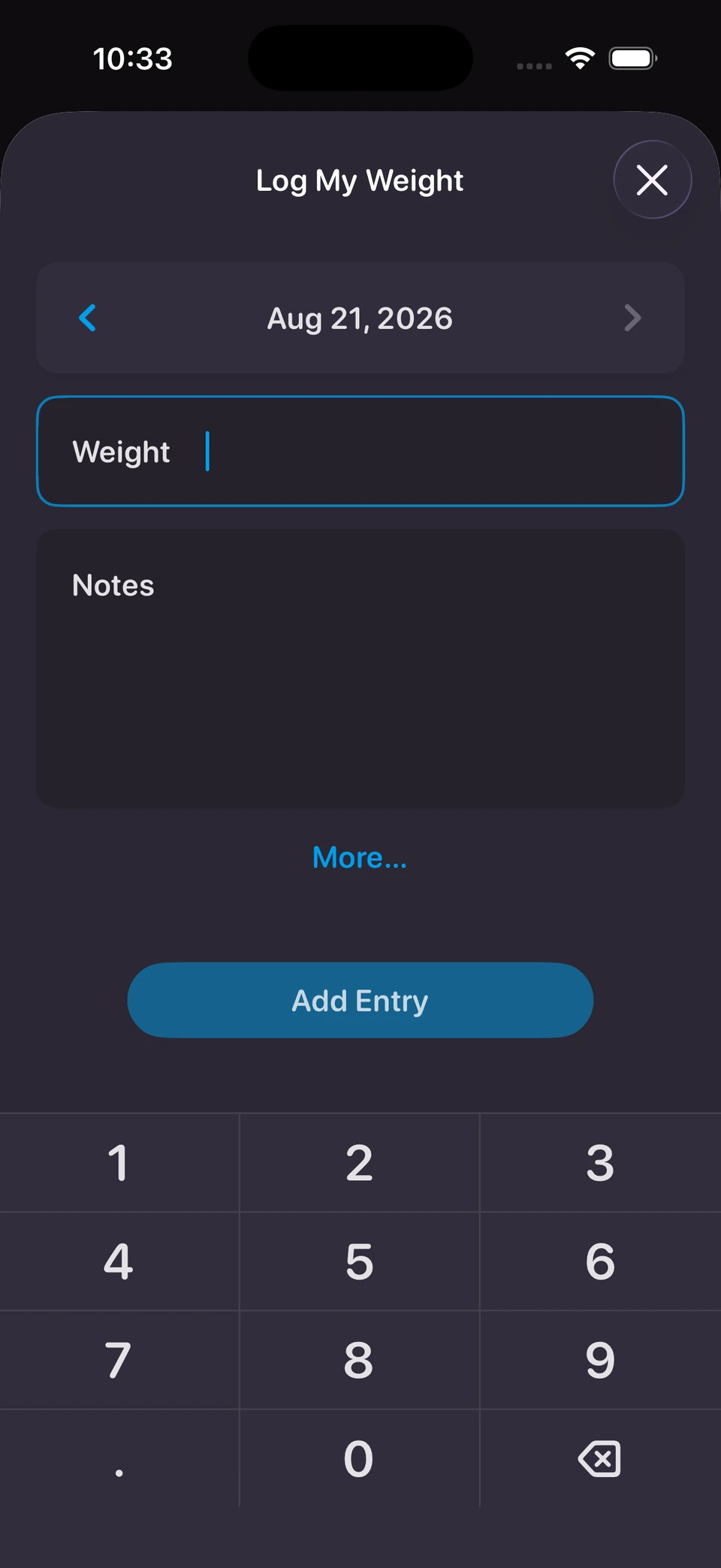
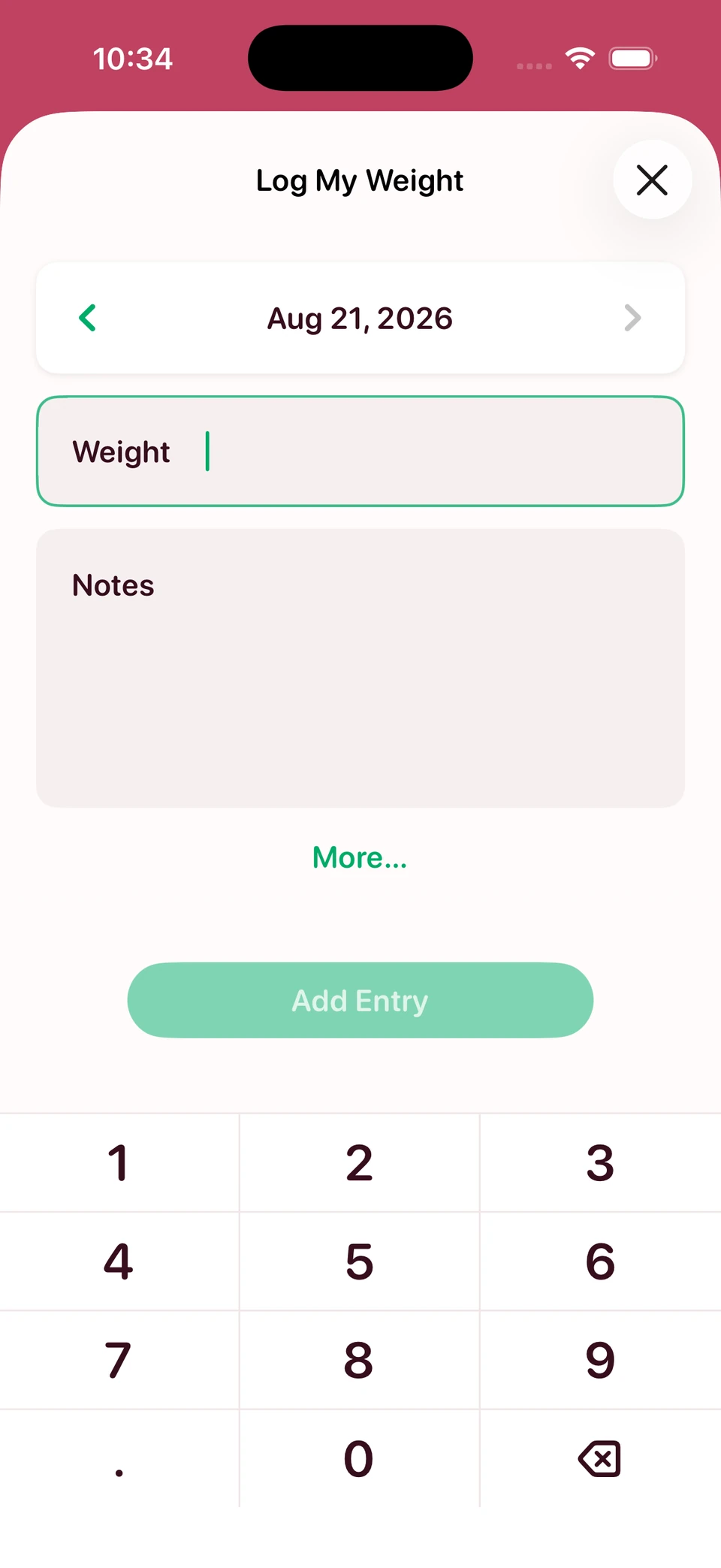
There’s still more work to come in future releases, but we think this is a huge improvement that makes all of the most important screens in the app much more legible, and more consistent in how they relate to one another, across all themes.
Streamlining color palettes
Happy Scale has 13 color themes that pretty dramatically change the look of the app. These are not just simple accent color swaps; nearly every color used in the app is theme-specific, and some of these themes make some pretty…bold choices.
We knew we wanted to make some sweeping changes to these themes, in an attempt to flip many of them from “weird novelty” to “pretty nice!”. But we also didn’t want to completely change the character of any of the themes — again, our goal at this point is to renovate, not rebuild. This was difficult to do at first, because our use of color across themes was pretty unruly. When palette color A does not relate to palette color B in the same way across all themes, it becomes very hard to reuse those palette colors outside of the specific context they are tuned, per-theme, to work in. This leads to all sorts of color inconsistencies, and themes that look good in some contexts are a mess in others.
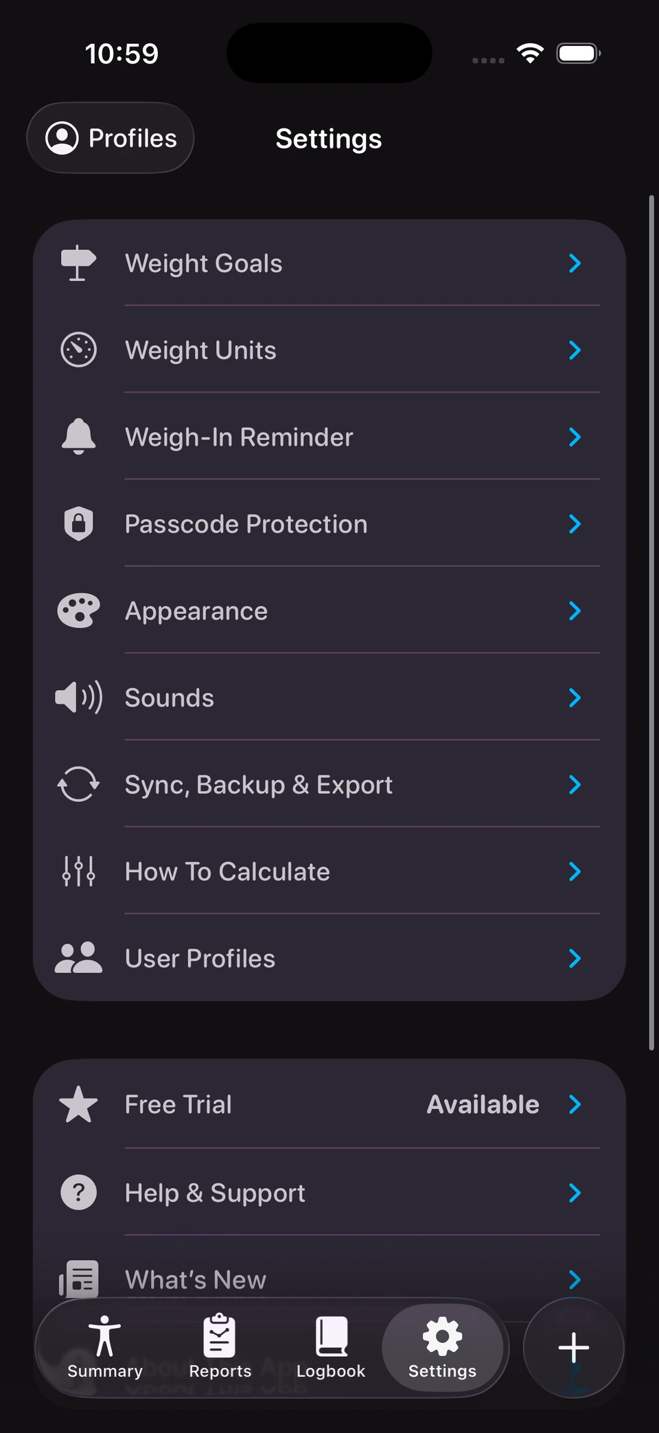
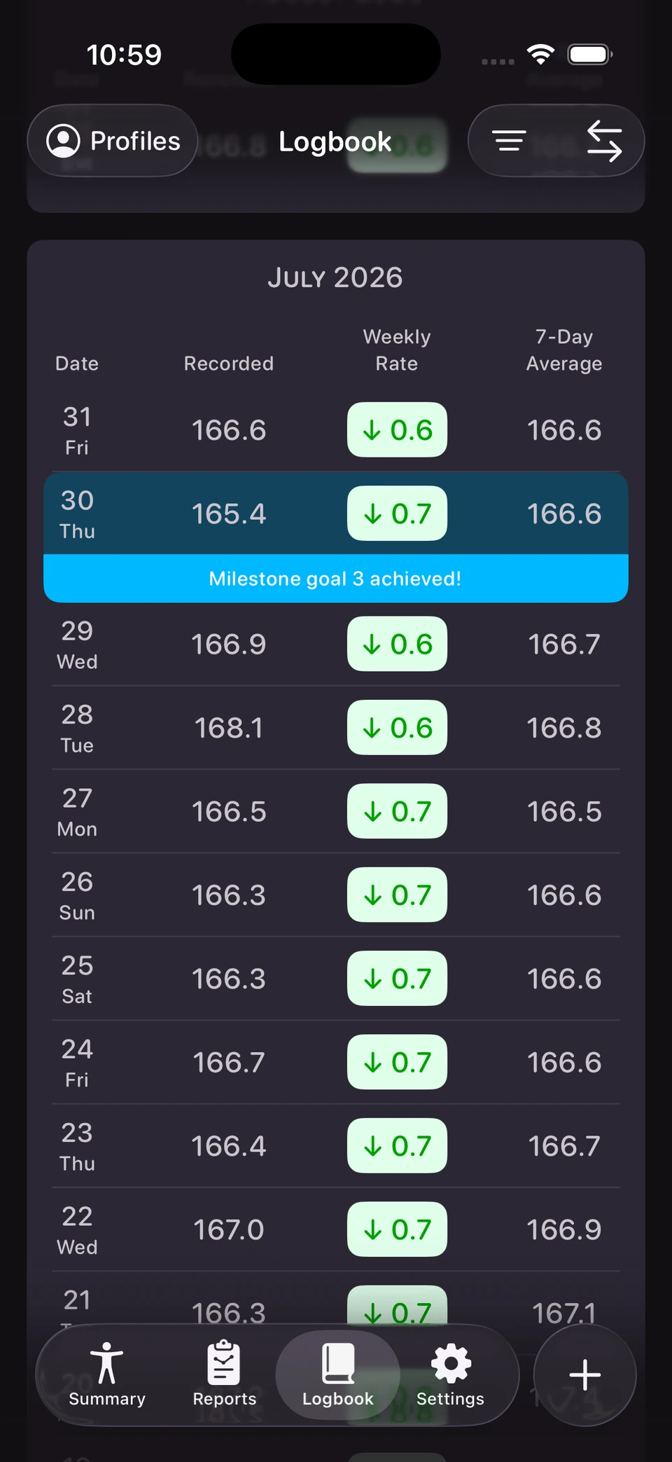
So, to make our themes more streamlined and internally consistent, and also to make our lives easier as we design new features in the future, we did a top-to-bottom rethink of the minimum set of colors each theme needed to define. We ensured that these colors related to each other consistently in all themes, such that designing a feature with these named colors in one theme would necessarily result in a design that “looks right” in all other themes. This is also important because it leads to much greater consistency in the design; it creates a language where each color has a role, making every interaction and element in the app more predictable and less distracting.
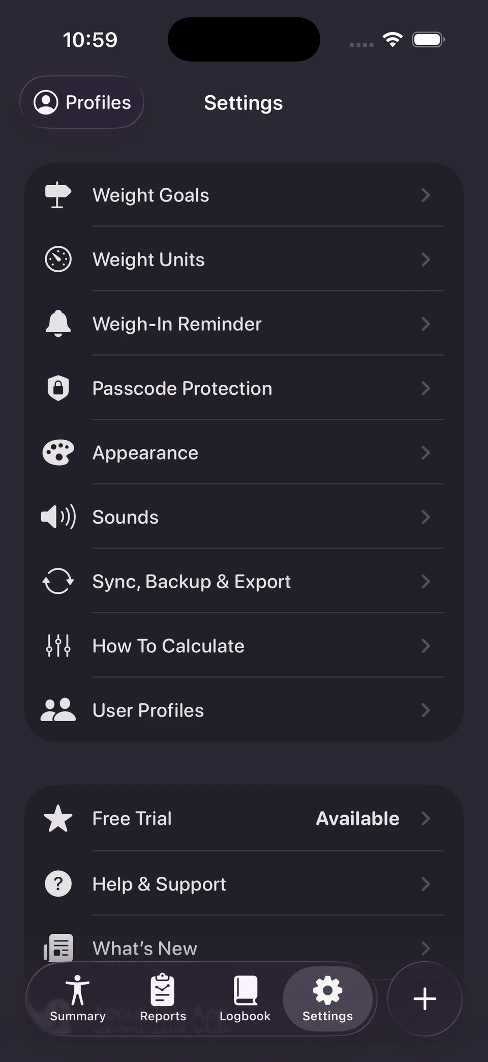
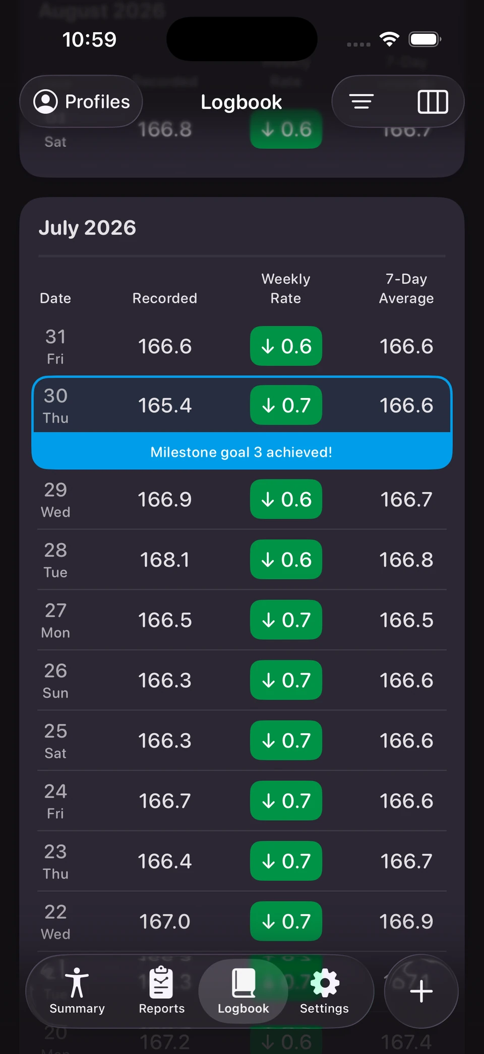
Ultimately, if you’re a Happy Scale user, you should notice better contrast and color balance in every part of the app. The change in most themes shouldn’t feel drastic, though some themes needed a bit more love than others. We believe that all of Happy Scale’s themes are far more palatable now than before — it may be worth taking another look at the options if you’ve been sitting on the default for a while!
What’s next?
We want Happy Scale to be one of the most beautiful and simple-to-use apps on the App Store, and this is the first step of many towards that goal. We will continue to roll out design improvements over time with this same “renovate, don’t demolish” ethos. If something about the new changes isn’t feeling right, we’d love to hear from you — we’ll keep tweaking as we go to make sure we’re finding the right balance between our design goals and Happy Scale’s classic feel.
More to come soon!